The Universal Windows Platform CommandBar control has a new feature called dynamic overflow since the Anniversary Update. This automatically adjusts the number of presented app bar buttons so that they fit and puts the additional commands in the secondary (overflow) menu. This addition has however inadvertently caused some headaches for developers who use Content property of the CommandBar to display additional content - it turns out, that alignment of the content now doesn't work properly.
The problem
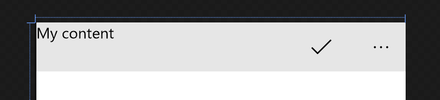
Let's demonstrate the issue with a simple example.
<CommandBar HorizontalContentAlignment="Center">
    <AppBarButton Icon="Accept" />
    <CommandBar.Content>
        <TextBlock Text="My content" />
    </CommandBar.Content>
</CommandBar>
We would expect, that the content of the CommandBar is aligned to the center of its available area, which indeed was the case before the Anniversary Update. Since Anniversary 14393 SDK, the HorizontalContentAlignment property is by default not respected.
Cause of the problem
The default control templates are stored in a XAML resource dictionary file on the following path: C:\Program Files (x86)\Windows Kits\10\DesignTime\CommonConfiguration\Neutral\UAP\10.0.14393.0\Generic\generic.xaml . If you search for the CommandBar template inside this file, you will find out that it contains a new VisualStateGroup :
<VisualStateGroup x:Name="DynamicOverflowStates">
  <VisualState x:Name="DynamicOverflowDisabled"/>
  <VisualState x:Name="DynamicOverflowEnabled">
    <VisualState.Setters>
      <Setter Target="ContentControlColumnDefinition.Width" Value="Auto"/>
      <Setter Target="PrimaryItemsControlColumnDefinition.Width" Value="*"/>
    </VisualState.Setters>
  </VisualState>
</VisualStateGroup>
As you can see, when dynamic overflow is enabled, sizing of the columns in the main layout Grid of the control changes. In the default visual state (DynamicOverflowDisabled ) is the ContentControlColumnDefinition.Width set to * (star) and the PrimaryItemsControlColumnDefinition.Width set to Auto . This means that the app bar buttons on the right take up a certain width and the remaining space is dedicated to the content. With dynamic overflow enabled, sizing of the columns is flipped. The control lets the primary items column take up as much space as it can (so that the available space can be used for the buttons and the number of displayable buttons can be calculated at runtime) and the content column now gets only the width it actually needs. Whichever alignment you set to the content doesn't matter. The content will always seem left aligned, because its column is sized just to fit. Since the Anniversary Update, dynamic overflow of the command bar is enabled by default.
Solution
You can disable dynamic overflow using the IsDynamicOverflowEnabled property. Although you have to make sure that the app bar buttons display well on all display sizes, you can also align the content as you please.
<CommandBar HorizontalContentAlignment="Right"
            IsDynamicOverflowEnabled="False">
   <CommandBar.Content>
      <TextBlock Text="Content" />
   </CommandBar.Content>
</CommandBar>
If you want to preserve the dynamic overflow feature, you may just want to put some margin around your content to make sure it looks aligned. Of course, to support multiple different display sizes, you should adjust the margins using Adaptive Triggers.