Most UWP apps can benefit from using the CommandBar control to present easily accessible commands to the user. Unfortunately the control sometimes behaves unexpectedly. Two of these surprising problems are addressed in this article.
Left-side commands
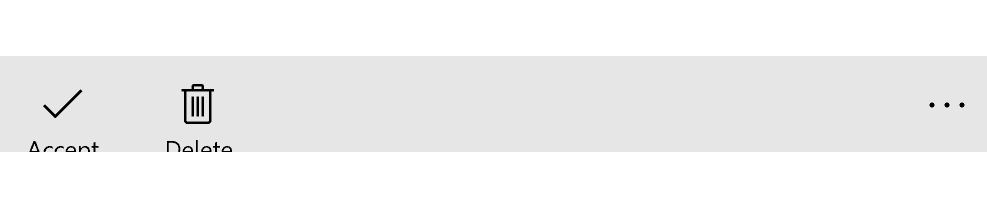
By default, CommandBar is designed to stack commands on the right side of the control. This allows easy overflow in case screen size is too small (DynamicOverflow feature introduced in Anniversary Update). Sometimes you might want to display commands on the left side of the control as well (for example a global command or a special action. Command bar is a content control and its Content property defines what should be displayed on the left. We can declare any markup here, but in this case we want to use AppBarButton controls. Example of this might be the following:
<CommandBar>
    <CommandBar.Content>
        <StackPanel Orientation="Horizontal">
            <AppBarButton Icon="Accept" Label="Accept" />
            <AppBarButton Icon="Delete" Label="Delete" />
        </StackPanel>
    </CommandBar.Content>
</CommandBar>
When we launch the application, we see the first problem immediately - the app bar button label is clearly sticking out from the bottom of the bar.
The reason is simple - the default layout of the app bar button is designed like this - the label is just situated in this position. When the button is part of normal PrimaryCommands collection of CommandBar, the control itself ensures to hide the label when the command bar is in normal state and display it only when it is expanded. It is quite easy to mimic this behavior by binding the IsCompact property of the AppBarButtons to the inverse of the command bar's IsOpen property.
<CommandBar x:Name="CommandBar">
    <CommandBar.Content>
        <StackPanel Orientation="Horizontal">
            <AppBarButton Icon="Accept" Label="Accept"
                IsCompact="{Binding ElementName=CommandBar, Path=IsOpen, Converter={StaticResource InverseConverter}}" />
            <AppBarButton Icon="Delete" Label="Delete"
                IsCompact="{Binding ElementName=CommandBar, Path=IsOpen, Converter={StaticResource InverseConverter}}"  />
        </StackPanel>
    </CommandBar.Content>
</CommandBar>
The InverseConverter is a simple IValueConverter that negates the provided boolean value.
Labels jumping all around (and disappearing)
The left commands now look and feel great and all seems rosy. At least in most cases. Not always! In about one try out of ten, you will encounter labels of app bar buttons displaying on the right side of the control or even not being present at all!

This is very curious and it took me a while to dig out a reason and solution for this. After some searching around I stumbled upon a Stack Overflow answer by Microsoft's Jay Zuo, addressing exactly this problem. The Anniversary update of Windows 10 introduced a new LabelPosition property, which determines where the label should be displayed. In the default state, it looks up to the parent (which should be a command bar) and checks the DefaultLabelPosition property, which can be Bottom, Right or Collapsed . This process works great when the app bar buttons are inside the PrimaryCommands collection of CommandBar, but when they are embedded inside a different control, like a StackPanel, they tend to do whatever they want randomly. Solution requires us to edit the default app bar button style and comment out the visual states for Right and Collapsed placement, including a related resource:
<Style x:Key="BottomLabelAppBarButtonStyle" TargetType="AppBarButton">
    ...
    <Setter Property="Template">
        <Setter.Value>
            <ControlTemplate TargetType="AppBarButton">
                <Grid x:Name="Root" BorderBrush="{TemplateBinding BorderBrush}" BorderThickness="{TemplateBinding BorderThickness}" Background="{TemplateBinding Background}" MaxWidth="{TemplateBinding MaxWidth}" MinWidth="{TemplateBinding MinWidth}">
                    <!--<Grid.Resources>
                    <Style x:Name="LabelOnRightStyle" TargetType="AppBarButton">
                        <Setter Property="Width" Value="NaN"/>
                    </Style>
                </Grid.Resources>-->
                    <VisualStateManager.VisualStateGroups>
                        <VisualStateGroup x:Name="ApplicationViewStates">
                            ...
                            <!--<VisualState x:Name="LabelOnRight">
                            <Storyboard>
                                <ObjectAnimationUsingKeyFrames Storyboard.TargetProperty="Margin" Storyboard.TargetName="ContentViewbox">
                                    <DiscreteObjectKeyFrame KeyTime="0" Value="12,14,0,14"/>
                                </ObjectAnimationUsingKeyFrames>
                                <ObjectAnimationUsingKeyFrames Storyboard.TargetProperty="MinHeight" Storyboard.TargetName="ContentRoot">
                                    <DiscreteObjectKeyFrame KeyTime="0" Value="{ThemeResource AppBarThemeCompactHeight}"/>
                                </ObjectAnimationUsingKeyFrames>
                                <ObjectAnimationUsingKeyFrames Storyboard.TargetProperty="(Grid.Row)" Storyboard.TargetName="TextLabel">
                                    <DiscreteObjectKeyFrame KeyTime="0" Value="0"/>
                                </ObjectAnimationUsingKeyFrames>
                                <ObjectAnimationUsingKeyFrames Storyboard.TargetProperty="(Grid.Column)" Storyboard.TargetName="TextLabel">
                                    <DiscreteObjectKeyFrame KeyTime="0" Value="1"/>
                                </ObjectAnimationUsingKeyFrames>
                                <ObjectAnimationUsingKeyFrames Storyboard.TargetProperty="TextAlignment" Storyboard.TargetName="TextLabel">
                                    <DiscreteObjectKeyFrame KeyTime="0" Value="Left"/>
                                </ObjectAnimationUsingKeyFrames>
                                <ObjectAnimationUsingKeyFrames Storyboard.TargetProperty="Margin" Storyboard.TargetName="TextLabel">
                                    <DiscreteObjectKeyFrame KeyTime="0" Value="8,15,12,17"/>
                                </ObjectAnimationUsingKeyFrames>
                            </Storyboard>
                        </VisualState>
                        <VisualState x:Name="LabelCollapsed">
                            <Storyboard>
                                <ObjectAnimationUsingKeyFrames Storyboard.TargetProperty="MinHeight" Storyboard.TargetName="ContentRoot">
                                    <DiscreteObjectKeyFrame KeyTime="0" Value="{ThemeResource AppBarThemeCompactHeight}"/>
                                </ObjectAnimationUsingKeyFrames>
                                <ObjectAnimationUsingKeyFrames Storyboard.TargetProperty="Visibility" Storyboard.TargetName="TextLabel">
                                    <DiscreteObjectKeyFrame KeyTime="0" Value="Collapsed"/>
                                </ObjectAnimationUsingKeyFrames>
                            </Storyboard>
                        </VisualState>-->
                        ...
                    </VisualStateManager.VisualStateGroups>
                    ...
                </Grid>
            </ControlTemplate>
        </Setter.Value>
    </Setter>
</Style>
Source code
Example source code for this article is available on my GitHub.
Summary
CommandBar is quite customizable, but using it in ways it was not directly designed for may lead to unexpected and unpredictable results. These situations can be resolved using straightforward workarounds, but we must still be aware of them while building your app.